Showing posts with label Distress Ink. Show all posts

Thursday, April 11, 2024

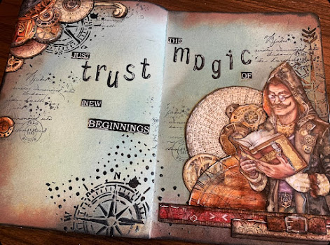
Trust the magic of new beginnings - Double page layout

Hi,

Today I have a fun double page layout to share with you. Using Sir Vagabond in fantasy world from Stamperia as my focal point. I’ve been playing in my stone paper journal trying out a few new distress oxide sprays and stain sprays that I just bough and just having a lot of fun enjoying my “me - time “. 


The colors I used for my background are Tim Holtz Distress oxide spray old paper and speckled eggs in oxide and vintage photo in distress stain spray. I also went around the edges with vintage photo ink pad with a blending tool and again with black sooth but this time only at the very edge.
I felt so lucky finding the stamp I used to stamp randomly on my background in the outlet section called Not kollage-K from Inkido. I love the script and that the post stamp circle has Oslo-Norway written on it. I grew up there and my family lives there so it’s just one of these little details that makes me happy. Next I mixed Finnabair Art basic 3D gloss gel and a thicker black acrylic paint together using it over a stencil from Stamperias Create happiness line. I love the effect of the 3D clear gloss on the more muted oxide sprays background. The bigger contrast really gives an interesting look.  


All the pieces used in this layout are from the fantasy world 8*8 papers. I fuzzy cut and went around all the edges with black soot and a finger dabbed to only have black edges on my pieces. I used Ranger Multimedia mat to glue everything down and carefully went just over the images. The glue will react with the oxide sprays if you get it on your  background.


I used the saying “Just Trust the magic of new beginnings” as my sentiment this time because l believe that sometimes you just have to trust the process.  For my finishing touches I traced around every image and some parts of the images where I wanted to add more detail with a black pen. I also added some highlights with my Sakura white gel pen. Make sure your glue is completely dry before you do this step or the glue will ruin your pens and/or markers.

I hope you liked this art journal layout and that you got inspired to create yourself a happy day crafting too. I sure love my creative moments. 

I’m entering this to:


Thank you for stopping by.

Hugs,
-Christine💮


Thursday, February 1, 2024

Valentine card - emboss resist technique

 Hi,

Today I have played with emboss resist. This is such a fun technique and the result you get is so cool. 

I think this background stamp from Penny Black is so pretty and it`s perfect for this technique. I stamped and heat embossed with Lindy`s white embossing powder. For my colours I used Distress ink in Tumbled glass, Peacock feathers, maybe a tad of Salty ocean and Vintage photo. I layed down the ink going diagonal. Then I lightly went over with a baby wipe to remove any excess ink on top of the embossed pattern. If you want to give the card a more feminine feel, you can just use different colors of ink. 

Next I cut down my panel to size and I also cut out a heart before I used foam tape to glue down my panel to my A2 card base. This turns the cut out heart into a kind of window, and it also gave my card some dimension and interest.


I stamped the sentiment from an old club kit from La la land and the stitched banner is also from them. I glued on some flat back pearls from Papirdesign as my finishing touch.

I love how this card turned out, this sure is a fun technique.

I`m playing along at:

Simon Says: Have A Heart | (simonsaysstampblog.com)

Simon Says: Anything Goes | (simonsaysstampblog.com)

Crafty Catz: Crafty Catz Challenge #664 (craftycatzweeklychallenge.blogspot.com)

Simon Says IG Challenge (@simonsayschallenge) • Instagram-bilder og -videoer

 February theme: ink blending


Thank you for stopping by and I hope you like my card. Why don`t you make your own valentines card and create yourself a happy day crafting too.


Hugs,

-Christine💮

Sunday, October 15, 2023

Explore the world of books

 Hi,

After a couple of weeks break and a nice family trip, I`m back with a double page mixed media art journal. I really missed letting my creativity flow so I had such a fun time creating this layout.

I`ve had this fantastic paper pad from Stamperia Vintage library waiting to be used again. I love the fantasy wibe with this paper - so inviting to let the imagination flow. 


For my background I used Distress ink in Tumbled glass, Salty ocean, Faded jeans and Black soot around the edges. This helps frame the image. Next I used Bold prints background stamp from Hero Arts to stamp randomly with black Archival ink. I stamped some small start in Hero arts white pigment ink, that was new to me and didn`t show up as much as I hoped, but it still adds interest to my background. I decided to add more stars with modeling paste and Stars Starry Nights stencil from Memory box. This stencil would give a very starry night on a background with a permenent medium like acrylic paint, but since I knew the modeling paste would pick up some color from the blue ink I knew my background wouldn`t turn out too busy. 


I used Ranger multimedia matt to glue down my images and also carefully brushed over my entire page with a dry brush sealing everything. This transforms the distress ink into a more vibrant color, making the sky appear more magical. I love how this turned out. Some white splashes and the sky was done.


I had to be creative and adjust the houses of books since the image only reached little over a page and I wanted it all the way across. So I found some books from the front page of the paper pack, and also images from regular books on different pages and then cutting some of the houses apart and adding windows and other elements from the main image to the regular books to make them look like houses too.


I had such fun creating this and kept on adding lots of little details to the book- houses on this layout. I used Faber-Castells Pitt artist big brush and dual marker to add more color depth and shades on the houses. I used black multiliner around the edges and also in between the houses and to each window and door to add more contrast and depth. I also added white gelpen to add some highlights to the details on the houses and books.


For my title I stamped Explore with Papirdesign  (PD2100365) and fussy cut the book roll that says "the world of books". To finish it off I added a gem to the moon. 

I love books and know how to appreciate a good fantasy story so this art journal is right up my ally.


I`m entering this to:


Wohoo!! I got a designer spotligt spot. Makes me so happy 😁


Thank you for stopping by, I hope you liked it and got inspired from this mixed media art journal to create yourself a happy day crafting too.


Hugs,

Christine 💮

Saturday, July 15, 2023

Feels like summer - Art journal with magazine cut outs

 Hello everyone,

I hope you are doing well 😊

Today I`m sharing a quick update with you on a new art journal page. This time created with magazine cut outs from some old magazines here from our cabin. We were expecting some rainy days so I was going through what we had of old magazines and newspapers so that my 6 year old son and I could play and create during these days.

When I saw  this week "We`re going around in circles" challenge over at Simon Says Stamp I actually cheated and made this page while we still had some good weather because I think all the slices with kiwi fits the theme perfectly in a summer vibe way. CKN Design- create happy days crafting (@ckndesign_craft) • Instagram-bilder og -videoer


The background is made with distress inks in tumbled glass, peacock feathers and faded jeans applyed randomly. I then sprayed with some water to lift off some ink with a paper towel to create some texture. Then I used Tim Holtz stencil dod fade, that I absolutely love, with faded jeans ink.

Next I stamped randomly around my page using two different stamps from Stamperias Create happiness stamp set in faded jeans and peacock feathers.


I used modpodge to glue down my magazine cut outs also covering everything with a thin layer so that everything got the same finnish and it also makes it possible to play with different inks ontop. 

Then I used a letter stamp set from Papirdesign (PD 2100365) and stamped "summer" with jet black Archival ink from Ranger. I wrote "time" with a black pen doodling in the letters using Tim Holtz Bubble stencil. You can just freehand this but I was enjoying myself and went with the stencil and filling in with my black pen. I used a black marker to add a frame to the pages and also added some white gel pen and added some black outline here and there on my page.


I`m entering this to Simon Says: We’re Going Around In Circles | (simonsaysstampblog.com)


I hope you got inspired to create yourself a happy day crafting too. 

Thank you for stopping by,

-Christine💮


Sunday, May 21, 2023

Forever by my side - Art Journal

Hi everyone,

I`m so excited to share this art journal page with you today. I`m totally in love with how this one turned out, even though it might be on the darker side for some of you. For my focal point I used an image I colored up myself, combining two of my favorit things, Copic coloring and art journaling. I just love the outcome and you will see me doing this more often in the future.

I`m sorry for the poor photo quality. The bright daylight wased out the colors a bit, I will try to take better pictures when I have time during this week. Hope you still like it :)  


The beautiful image is actually cut out from a coloring book I have from Mitzi-Sato Wiuff called Midnight Gardens. She is the artist behind Aurora Wings stamp. I don`t think the coloring book is still available anymore, but there are many stunning digital stamps on her Etzy shop. 


I used quite a lot of markers on her dress and I may have used hintes of markers not mention here as I was looking for the color combination I wanted, but here are the once I mainly used:

Skin: E50-51-11 - BV20 - R20
Gold: Y15- YR24-27-E15
Red: R20-22-24-29- Grey T7 for deeper shading 
Orange dress: YR000-00-31-38-16
Flowers: RV00-55-66-69 - R22
Green: YG03-17
Skull: Grey C:0-1-3-5


For my background I used some blue shaded distressinks on a plastic sheet, spritsing it with water and then dabbing the plastic sheet on y pages. Then I used a background stamp from Stamperias Create happiness stamps and stamped randomly with Tumbled glass and Faded Jeans. Then I used black Archival ink for the text stamp and the cute flowers I stamped along the bottom of my pages, also from the same collection. I decided to color my flowers with gold acrylic paint to get a more ancient Japan feel to my pages. As a finishing thouch I splattered with gold acrylic paint, used my white Sakura gelpen for some highlights and my black Copic multiliner for some black details and I also wrote my text for hand since I was crafting at the cabin and didn`t have anything else to use for my quote. 


I love the contrast of the beautiful lady with her stunning kimono holding a skull in her hand as she looks back at you. I think the words " Always by my side" fits the image well as she walks holding the skull, but I guess it also has to do with the date as today was my wedding day. This summer it will be 8 years since ha suddenly past away and he would also have had his birthday the 23th. So I guess you could say that these days every year he is in my thoughts more often.


I`m entering this in :Simon Says: Art Journal | (simonsaysstampblog.com) (second entry)

I hope you like todays art journal, and that you got inspired to create yourself a happy day crafting.

-Christine

Monday, May 8, 2023

Art Journal - Bee happy

 Hi, 

Today the sun is shining, and you really trust the feeling that spring is finally here. It feels like today is going to be a good day and what better way to start it than to share my new art journal layout with you. I`m totally in love with how this one turned out.


While I picked up some groceries on Saturday I came across these adorable napkins that I just got so many ideas on how to use in my crafting. On one part you got these bigger bees and on the other side they where smaller and lots more all on top of these pale yellow polkadots.


Cute.. But now back to my art journal pages. I skipped one page and started to create my background with Distress inks in Tumbled glass, Peacock feathers and Faded jeans. I spritzed on a good amout of water letting the ink do its thing before letting it dry completely. Splatters in Walnut stain and white gesso with my fan brush. I put my crafting mat under the page I wanted to cut in as not to ruin the other pages in my book, and used some round Spellbinder dies as my guide as I carfully cut out the three circles with my craft knife. Then I cut out the scallop borders with my X-cut nesting dies in brown cardstock darkening the edges with Walnut stain. The circles dont have a perfect match and since I didn`t want two offset circles on the same page I cheated and ripped the smallest one and adjusted it to fit hiding the overlap under my bee. 


Fore my page behind I peeled off the back layers of my napkin and placed it the way I wanted the bees to show up peeking through the circles and glued it down and sealed it well using mat modpodge. I also did the same with the bigger bees on a pice of cardstock before I fussycut them when they where dried  completely. Before I glued them down I traced all around the edges with a black marker as not to leave a white border.


I went ower the wing with the lightest blue Copic markers to tye everything together using the colors B0000-B000-B01. It`s extremly important that the modpoge is completely dry before you color ontop of it since the glue will destroy your marker nib if still wet.


I darkened the edges of the papers with Faded jeans and Walnut stain and cut out the letters for my motivational words on black card stock. The word happy is from the Tim Holtz booklet. I used my Sakura gel pen and a black pen to add some finishing touches.


I just love the outcome of this and how fun and cute it is with the bees from the napkin peeking through from the pages underneath. 


I`d like to enter this in:

Colorful Options: May 2023 Blue - second entry

Simon Says: Paint It | (simonsaysstampblog.com) - second entry

Simon Says: No Patterned Paper | (simonsaysstampblog.com)


Thank you for stopping by, I hope you liked it and that you got inspired to create yourself a happy day crafting.

- Christine


Friday, April 28, 2023

2 page Art Journal - Travel, Blue Dream

 Hi, Today I`m sharing a double page layout and it`s my first time playing in my small Dylusion art journal. I`m actually working on the secon page, since I have something special in mind for my first page wich I will share with you soon.

I`m totally in love with how this layout turned out. I used papers from the beautiful Blue Dream collection from Stamperia. I`m just so in love with this paper collection, and I actually bought it to make a mini album from a trip to Gran Canaria with my dear friend but I couldt help myself from diving a tiny bit into the beautiful papers already, making a travel, sea and summer themed journal page.


The borders and most of the elements are cut outs from the 12x12 paper pack, and and some elements are from the ephemera pack.  


For my background I used Distress Inks from Tim Holtz and I must admit this is kind of alian territory for me since I mostley used to copic color images and finnished of the card with pattern paper. I don`t have many colors, I have one round and one square old blending tool and for my vintage photo color I just held the foam with my fingers. Still, just playing around with different techneques like spraying water on the page, lifting color using stencil and dabbing on some ink in the two darkest color through my stencil. I`m super happy with how my background turned out. 

I did however get a dark color transfer smear just over the travel word when I was nearly finished, but I`m not going to let it bother me and take away the joy I feel from this layout. It`s part of my learning prosess, and remember- it`s just creative fun with beautiful colors, papers and ink. Don`t let small mistakes like that discourage you :)


And here are a few close ups showing the bautiful paper and the lovely background. I used wild honey, spiced marmalade and vintage photo distress inks. The stencil I used is called Compass and is from the Welcome home collection from Stamperia.
I finished of my project with my white Sakura pen to add some highlights.


I would like to enter this in:


Do you like to travel? I hope you got inspired to create yourself a happy day and enjoy some crafting time. Thank you for stopping by.

-Christine


Thursday, March 30, 2023

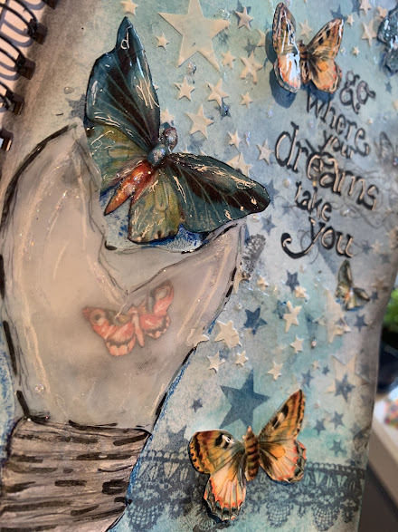
Art journal - Go where your dreams take you

 Hi everyone,

I`m uploding another mixed media page today and I just love how it turned out.

For the background I used Tim Holts distress inkpads, then I stamped the laceborder and butterflies with some old Prima stamps I`ve had for years, before using this great star stencil to create this magical sky. 

I was thinking of the contrast from day to night, light and dark, and the butterflies that symbols change, growth and new beginnings. So the stamp saying "Go where your dreams take you" fits perfect, don`t you think?


For the light bulb I scetched and cut out two layers of vellum, keeping the to part open so as if the butterflies come out from the light. 


I also placing one inside the bulb. The butterflies is from one of the most beautiful patternpapers I know of, the Mariposa paperpad.


Thank you so much for stopping by, I hope you got inspired to craft a happy day for yourself :)


Im entering this:

-Christine