Hi,
It`s time for CMN Christmas calender, and today it`s my turn.
I have made two rosettes that can be used as gift tags, or you can use them as Christmas decoration.
These are approx. 12 and 14 cm in diameter
Hi,
It`s time for CMN Christmas calender, and today it`s my turn.
I have made two rosettes that can be used as gift tags, or you can use them as Christmas decoration.
These are approx. 12 and 14 cm in diameter
Hi,
Today I`m back with another art journal layout. I really do enjoy sitting down with some "me- time" and just letting creativity flow, playing around with colors, textures and fun techniques. Today I got my inspiration from the napkin that I used on this layout. The colors and the beautiful flowers are right up my ally. And I do love the black background even though I ended up tearing away most of it for this project. I actually got these napkin somewhere eating out, making sure not to spill so I could take it with me😂
I saw that Simon Says Stamp Wednesday challenge blog theme this week was texture and they were showcasing Tim Holz products. So I wanted to really challenge myself limiting myself to use mostly products from him. Why the challenge? Because I have like one old stamp set and a few stencils from him. But I just got my new distress paints that I`ve wanted for a while, and I also got the Opac Distress crackle paste. Lots of products I never tried before, so this was fun.
For my background, I used distress paint in Dried marigold, Ripe persimmon, Wild honey and Rusty hinge, applying the colors randomly with a dry flat brush. After drying this first layer, I applied a mix of wild honey and dried marigold with a sponge dabbing it over the Harlequin stencil from Tim Holtz to add some texture to my background. Next, I applied a thin layer of the Distress Opack crackle paste using the Clockwork stencil. I added some white splashes with acrylic paint and used a black marker to draw a black frame around the page.
Finally time to add my napkin flowers, leaving one layer of white as to not have the flowers disapeare on my painted background. I kind of wish I left all layers, but it turned out clear enough. I used clear gesso to glue my pieces down, also adding a coat on top of the flowers. The butterfly is from an old Stampers Anonymous Tim Holz stamp set that I`ve had forever called Fairytale Frenzy CMS 058. It`s the only stamp set I own from him today, but I really do love it.
Sorry for the bad lighting in this last photo. The colours are shown more accurate above.
I had so much fun creating this layout. It was kind of personal and I do love the way it turned out.
I`m entering this to:
Simon Says: Add Some Texture | (simonsaysstampblog.com)
Crafty Catz: Crafty Catz Challenge #664 (craftycatzweeklychallenge.blogspot.com)
Thank you for stopping by, I hope you liked it and that you got inspired to create yourself a happy day crafting too.
Hugs,
-Christine💮
Hi,
Today I`m sharing a masculine card made out of the amazing papers Sir Vagabond in Japan from Stamperia. I fussy cut my focal point from the Collectables pack and I just love the look of the samurai used on this card.
Hi,
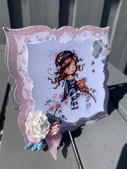
I have been enjoying myself with some Copic coloring and had fun finally putting this layered shaped card together. We are still taking things slow at the cabin so I actually had the papers for this card die cut at home before we went on our vecation. I`m kind of impressed with my planning ahead....😜
Since I`m still on a mission to use up papers from my stash I found this pretty paper from Maja Design, "a day in May" from an older collection for my first layer and a pattern paper with flowers and butterflies from Papirdesign for my second layer.
The papers are so pretty and together with my colored image Sweet blossom from Whimsy stamps this card turned out super cute I think.
I used foam dots to add some dimension to my card. The butterflies are cut out from another pattern paper and the flowers are from WOC. I made a small bow with some pink seambinding.

Copic colors used:
Hi,
The Mixed media Art journal page I`m sharing today was actually finished ower a week ago but since the screen on my phone is broken and I forgot the charger to my laptop on the cabin I had to wait to upload it until we came back here.
So on the 25th of June it was 8 years since Tim passed away and I wanted to make an Art journal page about the loss of a loved family member and also my best friend.
For my background I used acrylic paint in two shades of blue, a touch of purple and some white applied with a dry flat brush. I used some modeling paste and this beautiful stencil from Tim Holtz called Crossed on the top and bottom of my page. Next I used a script and a circle stamp from Stamperia and stamped randomly around the page to add some interest to my background. I used a more muted mat black ink pad, I think its called midnight sky or something. I will check when I get home. I love the muted effect this ink has and how it was perfect for my heavenly sky. I also darkened the edges on my page as to frame it and make my focalpoint pop more.